From the Designer's Desk: SpotDraft's New Signing Experience
Last updated: June 22, 2026
How we rebuilt the most-used page in our product without making it a second slower.
The page everyone uses and nobody talks about
Every contract in SpotDraft, no matter how it's created, negotiated, or approved, ends up in the same place: the signing page. It's the one surface that every counterparty touches including people who have never seen SpotDraft before and may never see it again. For thousands of signers, this page is SpotDraft.
The page worked — and the data proved it. Signers completed signing in an average of about 13 seconds, with more than a million contracts per year this way. There was no fire to put out, no metric falling off a cliff. So why rebuild it?
As a designer, the brief was deceptively simple: make it better without making it slower. What I kept coming back to was a question that sounds obvious but isn't: what does signing actually feel like on paper? There's no sidebar, no overflow menu, no status badge, just a document and a line that tells you where to sign. That became the lens for every decision.
A mobile page living on a desktop screen
When we audited the existing experience, the most fundamental finding wasn't a broken button or a confusing label. It was architectural: the signing flow was originally designed for mobile, and then made to fit desktop screens.
The audit surfaced a consistent set of frustrations, drawn largely from real user feedback and support tickets:
Actions like Reassign and Decline weren't intuitive or easily discoverable.
The AI summary felt like an added layer
When the flow auto-navigated between fields, users needed better visual guidance on where to look and focus.
One more thing shaped everything: our customers increasingly wanted to put their brand on the signing experience. The old layout simply couldn't scale to support whitelabelling without breaking.
The iterations that taught us
Every iteration taught us something new.
A heavy side-panel navigation, while effective on large screens, cramped the document on smaller ones.
The second iteration pushed controls directly into the document view, which cluttered the reading experience without changing the interaction model.
What we deliberately kept
A redesign isn't an excuse to relitigate everything. Some parts of the old flow had earned their place, and signers knew them well:
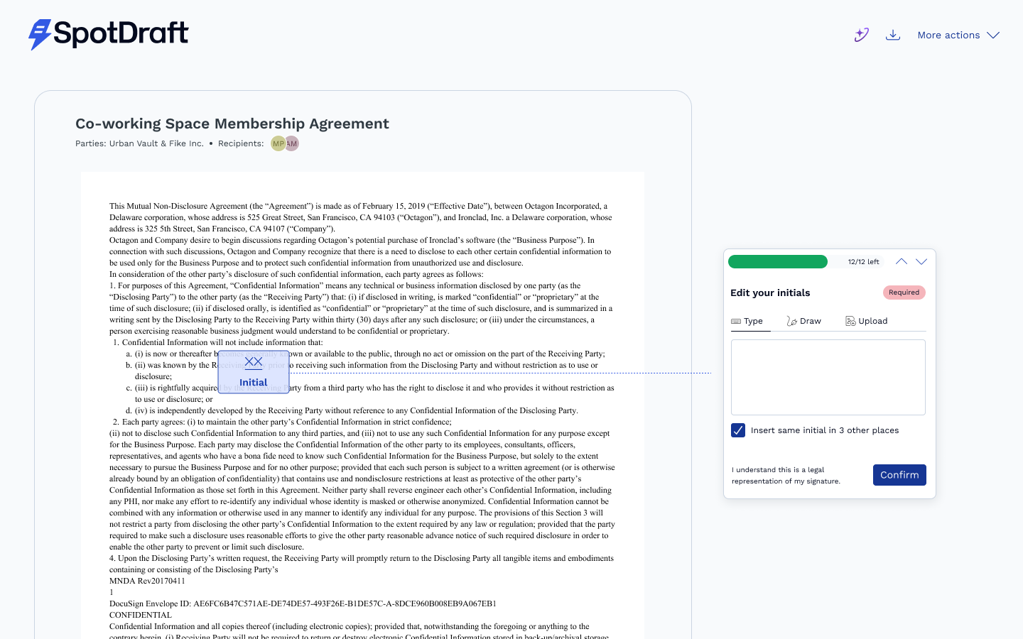
The three ways to sign — Type, Draw, or Upload. Familiar, flexible, and legally sound. Untouched.
Auto-applying your signature and initials across the document. Write once, and then "insert same in other places" in a single click.
The progress tracker. Signers could always see how many fields remained. We didn't remove it — we promoted it (more on that below).
The philosophy: change the chrome, but not the muscle memory.
The biggest change: the page now guides you

The heart of this revamp is something we call guided navigation.
In the old flow, auto-navigation existed, the page would move you between fields but signers told us they didn't know where to look when it happened. The document scrolled, something changed, and their eyes had to go searching.
The new experience replaces that ambiguity with a continuous, visible guide.
Complete a field, and the guide moves - visibly - to the next one. You're never left scanning the page wondering what the document wants from you. The guide walks; you follow.
Bringing the actions out of hiding
The audit's most repeated finding Reassign and Decline weren't discoverable had a simple, almost embarrassing fix: stop hiding them.
The old flow tucked these actions under a kebab (three-dot) menu. The new flow gives them a permanent home in the top toolbar: View contract info, Download, Reassign signatory, Decline to sign - each one a labelled, always-visible icon.
Reassign deserves a special mention. It's the action you need when a contract lands in the wrong inbox, which is precisely the moment you have the least patience for hunting through menus. It's now one click from the header with a note field, so handing a contract to a colleague comes with context, not just a redirect.
More document, less everything else
A signing page has one job: let someone read and sign a document. So the new layout is ruthless about giving the document room. It now runs edge to edge down the page, the header collapses as you scroll, and the contract info lives in a panel you summon when you want it, not a sidebar that permanently taxes your reading space.
Ask AI, now for the people who need it most
Here's a quiet irony of the old flow: the people most likely to need help understanding a contract: external counterparties, often signing without a legal team behind them, were the ones without access to the AI assistance.
The new flow extends Ask AI Summary to counterparty signers. Before committing to anything, a counterparty can ask questions about the contract — termination provisions, confidentiality obligations, renewal terms — and get answers grounded in the exact version they're about to sign.
Built to wear anyone's brand
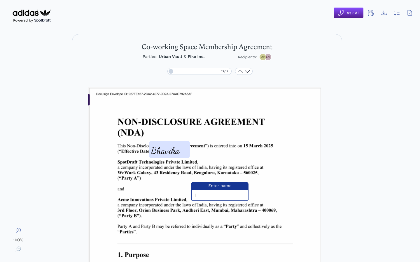
Underneath all of this sits the scalability goal: the new architecture supports white-labelling end to end. When a customer sends a contract, their counterparty sees the customer's logo and identity across the entire signing journey. The layout, the header, the modals: all designed to carry the customer’s brand. The old page couldn't do this. The new one was built for it from the first wireframe.
Did we keep the promise?
The new experience doesn't ask signers for more time. It asks for less attention: the guide knows where you need to go, the actions are where your eyes already are, and the page gets out of the way the moment you're done.
That's the whole philosophy, really. The best signing experience isn't one you remember. It's one you where you execute easily.
The Finish Signing Flow revamp was designed by Bhavika Maheshwari, with product direction from Rounak Khandelwal and Meghna Raghunathan, and engineering by Aaditya Raj, Manu Sharma and the sign pod under the guidance of Bharath Ravi.